DAZN Subscriptions
Moving DAZN from a flat subscription to a flexible multi-tiered offering.
Delivering solutions for 6 platforms, 5 countries and 14 new subscription packs.
Price sensitivity: Subscription increases were the main driver of churn.
Piracy concerns: High profile sports content was heavily targeted for illegal streaming.
Diverse audience needs: Fans had distinct interests, making content packaging complex.
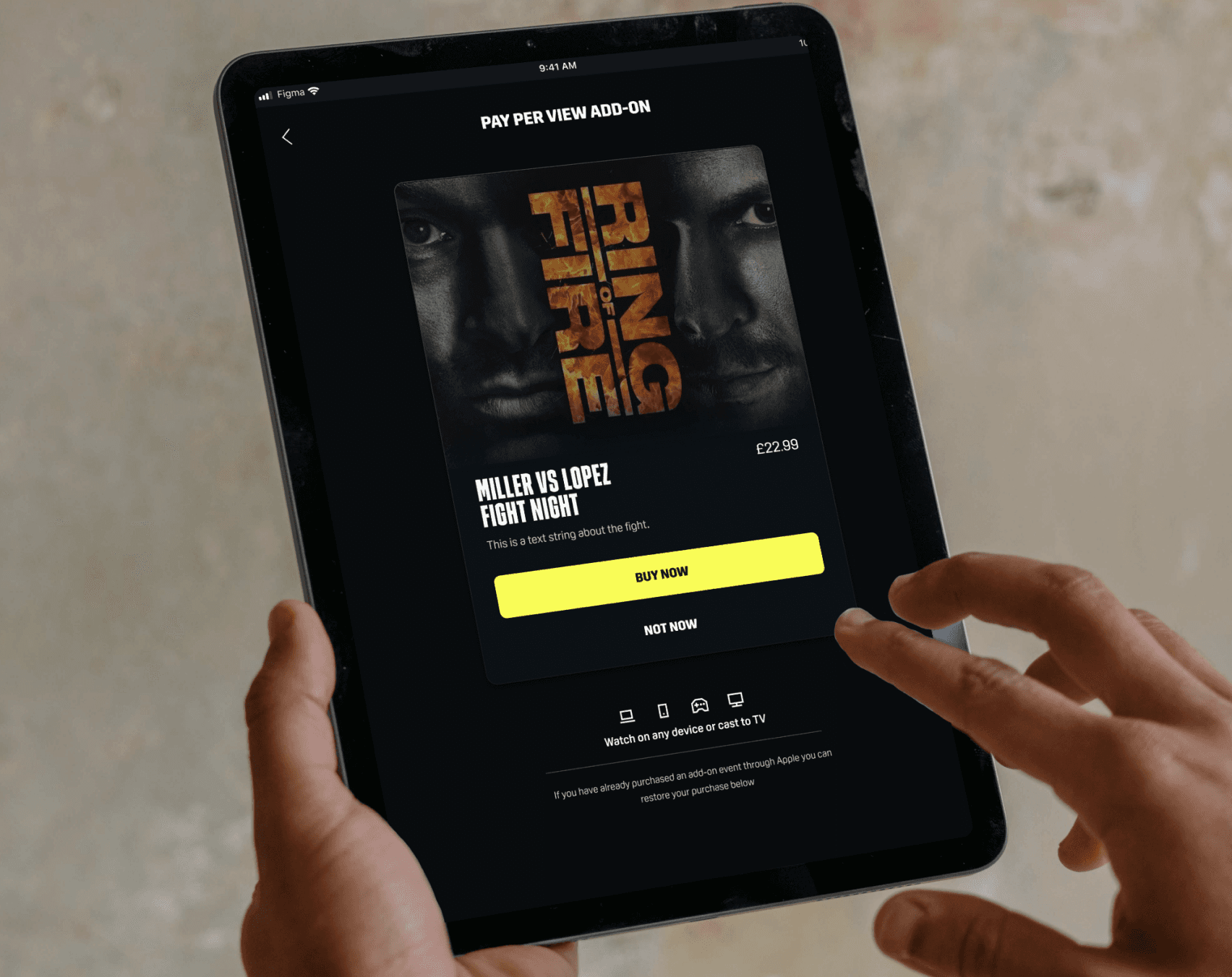
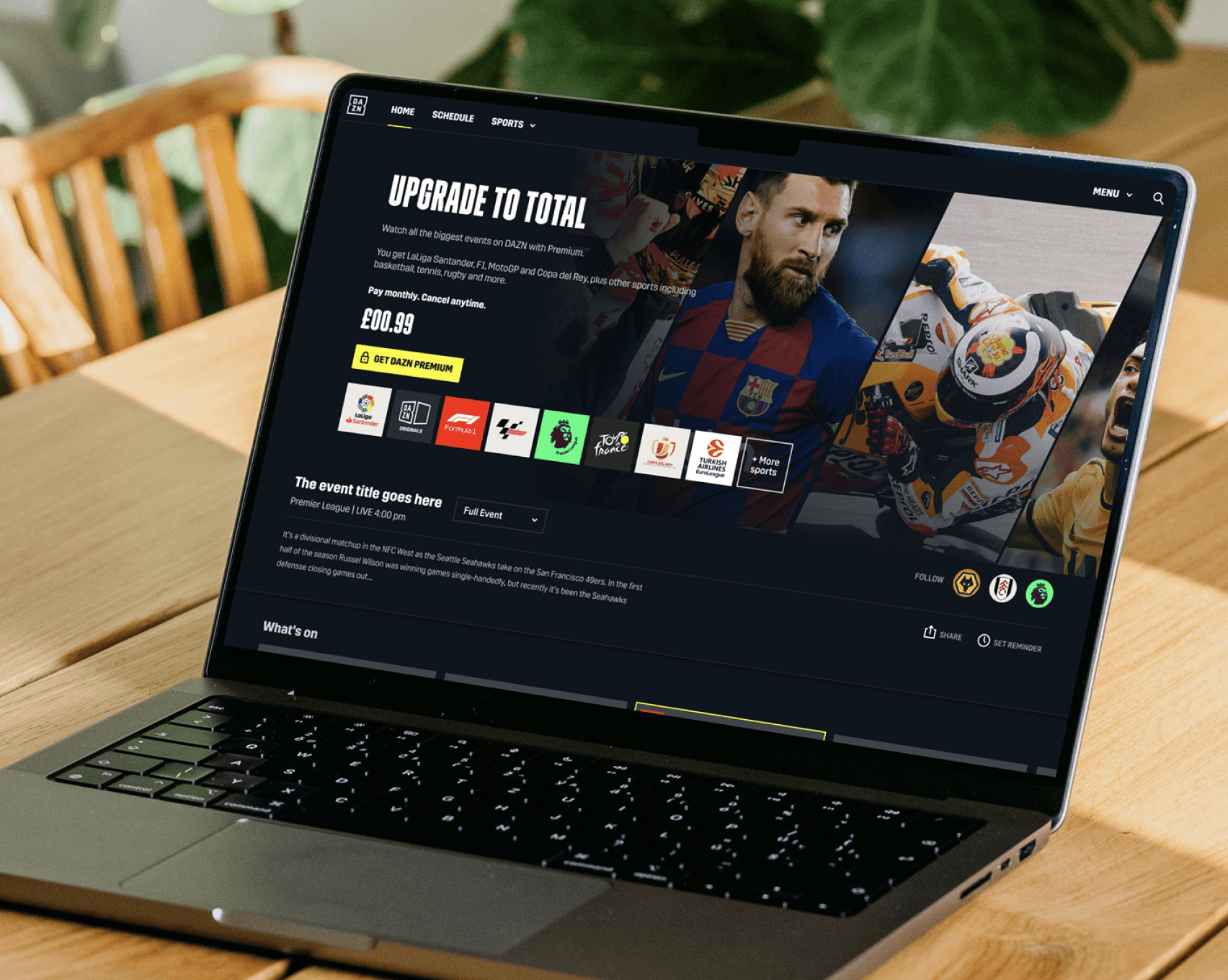
Monetisation strategy: Better structuring of major rights (LaLiga, Serie A, J-League, NFL) was crucial for growth.
The initial business proposal focused on feature based tiering (e.g., Mobile Only, 4K, Downloads) to encourage users to opt for premium plans. However, we also explored a content based tiering approach, allowing users to subscribe to sports they truly cared about to better match user behaviour and potentially improve retention.
My role as a Senior Product Designer was to deliver this project E2E leading a team of 12 multi-disciplined designers.
As part of our foundational research, we conducted a choice architecture study to understand how users make subscription decisions. This research explored whether users preferred feature based tiering (e.g., Mobile Only, 4K, Downloads) or content based tiering (e.g., football only, combat sports only). We also analysed user perceptions of pricing, their willingness to pay, and how easily they understood different tiering structures. The findings revealed market specific preferences, guiding us in shaping a pricing model that balanced flexibility, value perception, and business objectives.


HMW
To kick off the project with the design team I held HMW sessions in which we captured problem areas across the entire DAZN ecosystem from acquisition to engagement and retention. These would become a backlog of problems we would need to tackle throughout the research and design phases.
Working with engineering and solution architects we mapped out a rough solution enabling us to quickly align on technicalities and put our stake in the ground. During this stage I produced three key user flows across web, native apps and TV apps. Due to the structure of feature & content tiering it would create complexities between devices and user entitlements would differ.

To bring the proposed user flows to life we started to wireframe the experience, exploring differing solutions and ways in which we could present sign up, plans and payment options to customers. Through this work we also explored elements such as monthly instalments and paying upfront for plans.

We aligned quickly with key stakeholders and PM's through workshopping, including dot voting exercises to identify attributes that we mutually felt were worth exploring further via usability testing.

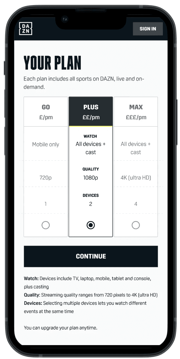
A: Pre-defined plans
Pre-packaged approach, presenting curated subscription tiers in a card based layout, simplifying the decision making process.

B: Build a plan "the wizard"
Allowing users to build their subscription, selecting their preferred devices, number of streams, and streaming quality, giving them full control over their plan.


Gathering usability findings
Usability sessions would be observed by all designers involved in the project (acquisition, engagement and retention) alongside PM's & copywriters. - Together we would collaboratively capture findings in Miro and our in house research team would synthesis and produce comprehensive reports

Headline findings
The key take aways from this test was that users liked being able to create their own plan but naturally they would often opt for the highest spec and would land on the same plan in the end. By having plans on display up front users were able to quickly compare and make a decision faster.


The majority of this research was conducted via usertesting.com, in the early stages it would be facilitated by our inhouse UXR team. Once we had a good understand on the foundations we would itteratively test areas via unmoderated testing.
After establishing an initial direction we moved at full force rapidly iterating and testing across all touch points of the experience.


To address inconsistencies across squads, we ran a one week harmonisation sprint, mapping discrepancies and aligning designs. This resulted in a final component guide, defining symbols and usage rules to ensure a cohesive UX/UI across all touch points.
Retention
Build empathy both within the team and within the product. Caring and having compassion equally for both.
Retention
Build empathy both within the team and within the product. Caring and having compassion equally for both.
Retention
Build empathy both within the team and within the product. Caring and having compassion equally for both.